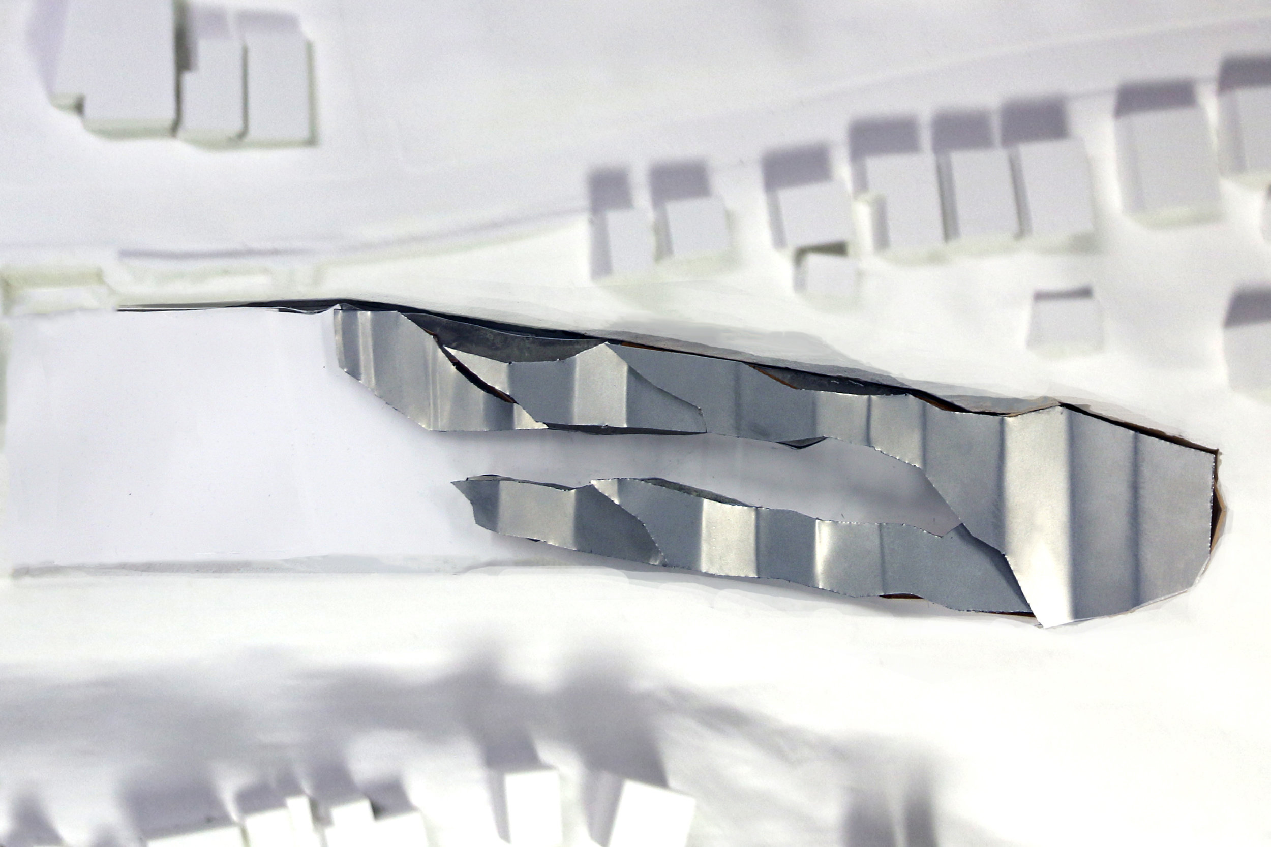
LIFTED TOPOGRAPHY
I began by deciding that I wanted my Aquatic Center to be light and open and to play with an ambiguity between interior and exterior space. After many iterations and tests, I finally settled on a design in which a light, canopy roof, whose folded shaped is informed by the natural inclined ground, covers a set of program that embraces visitors and draws them into a central courtyard space that is in axis with the main competition pool. The spaces get larger as the program beneath becomes more used, increasing in sections leading towards the competition space. The overall design also consists of two linear sections organized by dry-use program (offices) and wet-use program (recreational pools), all culminating into the one space both wet and dry conditions collide: the competition pool space. The spaces also form a connection to the outside, containing glazing on that allows for a lot of light. Additionally, the recreational pool space consists primarily of a roof and columns, allowing for a connection between the swimmers and the natural environment as well as creating an ambiguous environment in which one is both inside a covered space and exposed to the outside conditions.


